ESA WorldCover 10 m: how much of the metro is built-up, water, cropland and green — every share a pixel count.
The finding
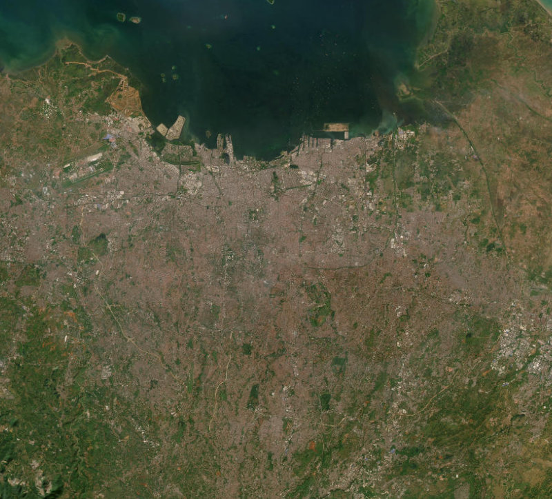
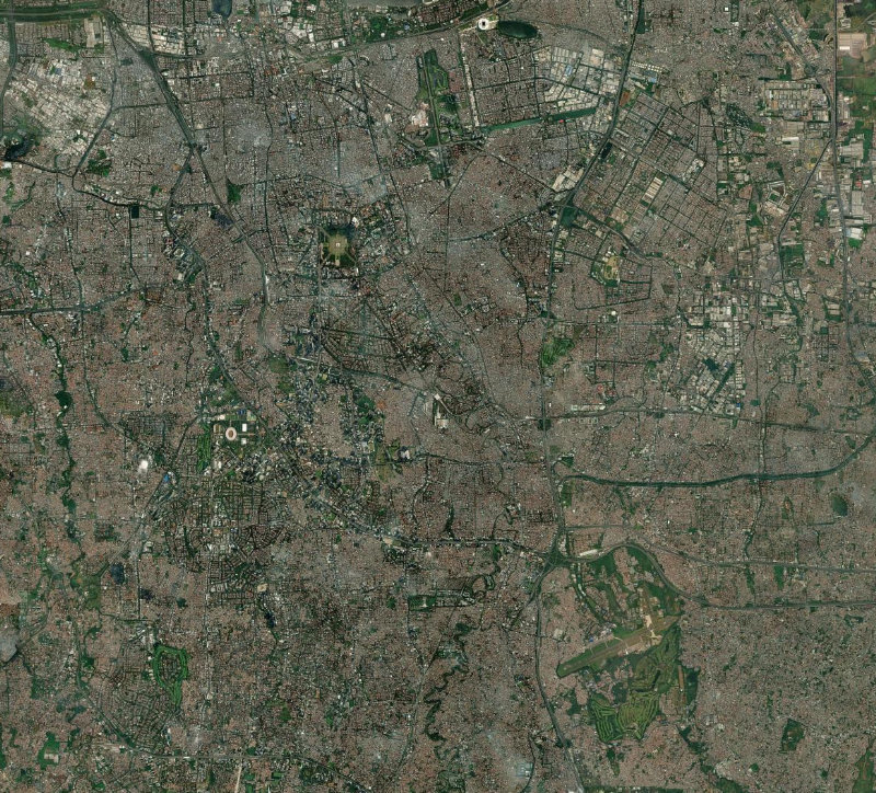
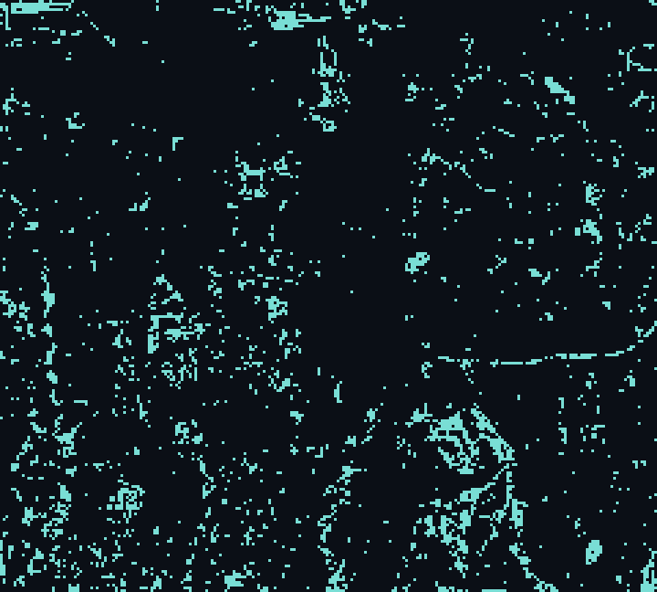
The 10-metre ESA WorldCover map classifies every pixel of Jakarta, Indonesia. The dominant class is Built-up at 84.4% of the 44,071 hectares read, with built-up land at 84.4% and open water at 0.9%.
The full breakdown
Every share below is a pixel count, not a planner’s estimate:
- Built-up — 84.4% (37,178 ha)
- Tree cover — 11.5% (5,085 ha)
- Grassland — 2.8% (1,237 ha)
- Permanent water — 0.9% (416 ha)
- Cropland — 0.2% (97 ha)
- Bare / sparse — 0.1% (46 ha)
A land-cover breakdown is the honest baseline for everything else. You cannot argue about encroachment, green cover or flood risk until you agree on what the ground actually is — and here, that agreement is a measurement rather than a negotiation.
84.4% of the area is built-up.measured over Jakarta, Indonesia · public satellite data
How to read a land-cover map
Land cover is the vocabulary every other analysis borrows. Before you can argue about encroachment, green space, heat or flood risk, you have to agree on what the ground actually is — and a per-pixel classification is the least arguable way to settle it, because it is a count rather than an impression.
The shares are the point. A metro that is four-fifths built-up behaves nothing like one that is half cropland, and the difference shows up in temperature, runoff and air. Reading the class breakdown is how you replace a vague sense of a place with a measured profile of it.
Why the land-cover baseline matters
Almost every hard question about a city — is it overheating, is it flooding, is it swallowing its green space — reduces, underneath, to a question about land cover changing over time. Fixing an honest baseline is the unglamorous first step that makes all those later questions answerable rather than rhetorical.
Because the classification is a pixel count, the baseline is not up for negotiation. That is its quiet power: it replaces the argument about what a place is with a measurement of it.
Reading this alongside the other layers
Land cover is the layer every other analysis leans on. Read it with a surface-water history to see which of today’s built-up pixels were water within living memory, and with a flood-exposure screen to find the low ground that has been paved. The classification says what the ground is; the change layers say what it used to be.
Where these numbers come from
Every figure on this page is measured, not guessed. We read it straight from ESA WorldCover 2021 v200 — the same public satellite record that scientists and government agencies rely on — across the exact area shown on the map, counting 5,186,160 individual pixels of ground.
Because the source is a fixed, published dataset and the study area is a fixed boundary, the reading is fully reproducible: open the same place in the Dyaan workspace and you will get the same numbers, to the hectare. Where the data can answer a question, we give you the figure. Where it cannot, we say so plainly rather than reach for something that merely looks authoritative.
What this analysis is — and what it is not
This is a single-year snapshot at 10 m. It is excellent for shares and patterns, but one 10 m pixel can blend a narrow road, a thin canal or a tree line into whatever surrounds it.
Dyaan’s design rule is to state that footprint plainly rather than paper over it. A number here is only ever as good as the sensor and the method behind it, and both are named. Where the data cannot answer a question, the honest answer is that it cannot — and the tool will say so rather than fill the gap with something that merely looks authoritative.
Reproduce this yourself in about a minute
Every figure above is checkable, and checking it is the fastest way to trust it:
- Open the Dyaan workspace and sign in (the free tier is enough for this).
- Search for Jakarta, Indonesia, or draw a rectangle over the same area on the map.
- Choose the Land cover analysis from the panel and press Run.
- Read the headline numbers, open the table for the full breakdown, and export a CSV or PDF if you want to keep it.
You are not limited to the places Dyaan writes about. The same engine runs over any lake, city, forest or coastline on Earth — so if there is a place you actually care about, that is the one to point it at.
A short glossary
- Class — one of the land-cover categories — built-up, cropland, tree cover, water, and so on.
- Pixel — a 10 m × 10 m square of ground assigned to exactly one class.
- Hectare — 10,000 square metres.
The bottom line
This is an original Dyaan field note — the words, the framing and the pictures are ours; the only thing borrowed is the public dataset behind it, ESA WorldCover 2021 v200, which is an input rather than an article. Nothing here is lifted from another publication, and every number can be checked in the tool.
If a place matters to you — a lake near your home, a forest you grew up beside, a valley that floods every year — you do not have to wait for Dyaan to write about it. Point the tool at it yourself and read the record for that exact ground. Open the workspace → · How every number is measured →